Video Stream
Saturday, July 19, 2008
6-Sara W
hey this is a really cool link check it out and watch the video: http://www.storyofstuff.com/
Thursday, July 10, 2008
Wednesday, July 9, 2008
Tuesday, July 8, 2008
6 - Katie
Found out about the new BMW museum in Munich. The video is interesting, it's cool how it ends in the form of a car.
http://www.engadget.com/2008/07/06/the-bmw-museums-kinetic-sculpture-takes-your-brain-to-another-d/
http://www.engadget.com/2008/07/06/the-bmw-museums-kinetic-sculpture-takes-your-brain-to-another-d/
Sunday, July 6, 2008
4-Sara W
i found this really cool thing on newyorktimes.com and i am not sure if i am attaching the link the right way but you should try and look at it :) http://niemann.blogs.nytimes.com/
Friday, June 27, 2008
Thursday, June 26, 2008
Split Decision

-Yoni
P.S. I forgot to post a good and bad design blog the other day. Sorry for being behind but I think the new Heinz bottles are a good design because they store upright allowing the ketchup to stay at the bottom and be there when you need it. It also avoids uses an anti-spill nozzle to avoid messes. I think most "tote" umbrellas are poorly designed because they don't open easily (or at all, actually) when they are supposed to which means that they are useless and don't work. I think things that don't work are poorly designed.
Wednesday, June 25, 2008
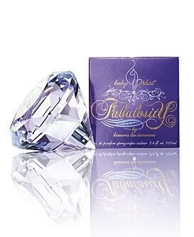
I think Kimora Lee Simmons perfume bottle for her new fragrance "Fabulosity" is a good design because it fits like a loose diamond in your hand and takes the form of the hand. It's sleek design makes it easier to hold on to while most perfume bottles are fairly difficult to control.
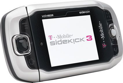
The sidekick is designed badly to me because it's too large to fit in your pocket correctly unless you have really deep pockets. It's heavier than virtually most cell phones and even though it has more functions and capabilities than other phones it's almost not worth having.
Good/Bad Designs


The hybrid car is a brilliant design because it combines a conventional engine with an electric motor used for local/non-highway driving to achieve better fuel economy. On the other hand, the upright toothpaste bottle is a faulty design. Although it allows for the toothpaste bottle to stand upright, it is difficult to squeeze out the toothpaste and when there is just a little bit left, it is almost impossible to get it out. In this way, the form of the toothpaste bottle does not help its function.
- Angie


I think the ballpoint pen is a good design because it is very reliable and useful . It also has a fairly simple design so that it can be inexpensive. The way it's put together and the materials used are important because the quick-drying ink makes the pen ideal for everyday use. It is small and light enough to carry around to use for any specific need. I think glass ketchup bottles are a poor design. They are shaped fine to hold the contents but the smaller neck of the bottle restricts and blocks the ketchup. Also, the designer did not pay enough attention to the properties of the contents and the needs of the user. There is no easy way to remove the ketchup from the bottle, which is the entire purpose.
- katie

 i think a good design is the vera bradley purse because they are cute and affordable but also they can surprisingly hold a lot of stuff. They are deceptive that way but I am always very surprised at how much they can really hold.
 i think a bad design are the hummers that get really bad gas mileage. with gas prices being as bad as they are it is just a waste to design a car that does not get good gas mileage. my friend has one and he said they get like 15 mpg, which is totally ridiculous.


I think the Swiss Army knives are well designed objects. They're convenient because they have many accommodations ranging from uncorking a romantic bottle of wine to fixing things with a screwdriver. It is also portable and the tools fold back into their slots so objects like the knife can be kept safe. The Forward-Backward Glasses (see right), however, I think are not well designed. Although the idea of having eyes in the back of your head is intriguing, the invention might be more confusing than helpful. The wearers of these glasses will see forward and backwards simultaneously, making it difficult to concentrate on one image.
Leslie
3-Sara W
The Rabbit

this is a wine bottle opener i have at home and i always thought it had a really cool design. you have to look carefully but its in the shape of a rabbit. its actually really fun to use and pretty easy also.

this is a wine bottle opener i have at home and i always thought it had a really cool design. you have to look carefully but its in the shape of a rabbit. its actually really fun to use and pretty easy also.

This telephone is poorly designed because it requires a lot more time and effort just to make a simple call
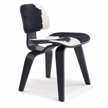
The LCW chair by Charles and Ray Eames designed their chair to cradle the human body unlike a wooden chair. The chair was designed using technology for molding plywood that Eames developed prior to, and during, The Second World War. The molded plywood legs provide superior strength and rubber shock mounts buffer against jarring movement.
2- Sara: Chair

Although it may not seem like it according to today's standards, the function of this Michael Thorton design trumped its form. When this chair was designed in 1856, Thorton was a furniture designer in Austria-Germany known for developing what was known as brentwood furniture and a special glue that was able to hold wood together longer than ever before possible. The simplicity of the chair made it cheap and easy to make and the curved shape of the back rest resembling the human siloutte was able to provide comparitively more support than a stool or something like it. Also, Thorton's glue, which was used to create all the chairs, gave them durability. The design of this chair inspired many to build upon the positive aspects of the cahir to create chairs that we know today.
Tuesday, June 24, 2008
 "Easy Edges Wiggle Side Chair by Canadian born Frank Gehry. "After discovering that single sheets of cardboard gained exponential strength when layered, he began to manipulate the simple material into graceful, curvilinear chairs and tables..." "
i find this chair very attractive and eye-catching. when i first looked at it, i didnt actually see it as a chair, i thought it was like some kind of decoration, because if you try to make it stand on the other side (it's base), it would look really unique and i wouldve thought of it as a carpet being pushed and sort of piled up in some way.
i wouldnt find it comforting, where the base is really dense and the back side isn't. the surface of it is perfect for a chair though. (only the upper part were we actually sit) the wood is going in curves and bending which is just right for the body position were usually in while we sit.
http://lovemyearth.blogspot.com/2007/01/creativity-with-cardboard.html
2 - Katie

So i had Marcel Duchamp and his work "Fountain" which is part of what he called "readymades", aka found art, because its made of an already existing object, in this case a urinal. The pieces called "readymades" are unique because they allow the viewer to interpret everyday objects in new ways. Duchamp took a normal, useful item and made it into a piece of art that is meant to be seen more than used. The piece is ironic because the form is as a fountain which makes it seem like it should be really important and prestigious, but he used a toilet which most people associate with being grimy and disgusting. "Fountain" is the most famous piece of the "readymade" series. The artist signed the piece "R. Mutt" which has been interpreted many different ways.
Philippe Starck - Juicy Salif

 Not all squeezers are meant to actually squeeze. Perhaps the most famous example of this is the Juicy Salif, designed by Philippe Starck in 1990. It is considered an icon of industrial design that has been displayed in museums such as New York's Museum of Modern Art. Originally, it was inspired by squeezing a lemon over a squid in a sea food restaurant, but many observers think it looks like a spider. It is manufactured by Italian kitchenware company Alessi. Its diameter is 14 cm, height 29 cm, and it is made from cast and polished aluminum.
 For the tenth anniversary of its launch, 10,000 were individually numbered and gold plated. There has also been a gray/black version. Both are now collectors items, the gray/black version particularly hard to find. The gold plated version was described as an ornament because the citric acid in a lemon discolors and erodes the gold plating. Starck is even rumored to have said, "My juicer is not meant to squeeze lemons; it is meant to start conversations".[4]
-en.wikipedia.org
The Juicy Salif by Philippe Starck may look like a spider at a first glance. While this juice squeezer does not serve as a practical tool, it is eye-catching and provocative. The form of the squeezer, again, resembles a spider while its function appears to be meant to squeeze juice, but rather it is an object of decoration.
- Angie
2-Sara W
 HENRY FORD: Model T"I will build a car for the great multitude. It will be large enough for the family, but small enough for the individual to run and care for. It will be constructed of the best materials, by the best men to be hired, after the simplest designs that modern engineering can devise. But it will be low in price that no man making a good salary will be unable to own one-and enjoy with his family the blessing of hours of pleasure in God's great open spaces"
Essentially Ford was trying to fuse together the ideas of both form and function. While the Model T was simple in its design it was both functional for the everyday family, and for the individual.
1-Yoni

Jonathan Ive has won six.
In less than ten years.
That's more than anyone else. Ever.
The Paperclip - Leslie
 The paperclip has been described as "the essence of form follows function". With its twisted design, the paperclip creates pressure which allows it to hold sheets of paper together. Unlike the staple, the paperclip does not damage the paper in any way and can also be easily removed. Over history, the paperclip has been used in many different circumstances. For example, during WWII, patriots wore the paperclips in their lapels in order to show their resistance to the Nazis. This later led the paperclip to be a national symbol in France. If unwound, the paperclip is thin and its tip can be used to fix computers or press tiny, reset buttons.
bridget

hey i had Ludwig Mies van der Rohe. He was regarded as one of the pioneering masters of modern architecture. He created an influential 20th century architectural style, stated with extreme clarity and simplicity. His mature buildings made use of modern materials such as industrial steel and plate glass to define interior spaces. After World War I, he began studying the skyscraper and designed two innovative steel-framed towers encased in glass. The significant buildings he designed include Barcelona Pavilion, Tugendhat House, Crown Hall , The Farnsworth House, Chircago Federal Center, Toronto-Dominion Centre and The Illinois Institute of Technology. One of the best known is the Barcelona Pavilion, in which it had a flat roof supported by columns. The pavilion’s internal walls, made of glass and marble, could be moved around as they did not support the structure. It has been widely studied and is a major source of inspiration from architects around the world. He also designed the Barcelona Chair, which was created out of chrome and leather.
stock.xchng
It's kinda late, but I found this really good website for finding stock images that you can use. Hope this is helpful!
http://www.sxc.hu/
- Angie
http://www.sxc.hu/
- Angie
Monday, June 23, 2008
A girl at my school started her own company (called a certain kind of oblivious) and makes silk-screened t-shirts. If you have facebook, you can check out some of the stuff she designs through her facebook group. I think she just started to sell them on an online store...
http://www.facebook.com/group.php?gid=23461175576
Leslie
tyara
1 - Katie: "Yeah Attitude" T-Shirt from Threadless
Hey its Katie. I'm not exactly sure what we are supposed to write but I found a cool T-Shirt on Threadless called "Yeah Attitude" and it has almost 2 different ideas. The top of the image is a scene during the day and the bottom is a similar design but its at night. The images are arranged in a cycle where the second one is upside-down. The two are connected by the word "yeah" but it's written so that it's read the same upside-down. I think the shirt design is different because it makes you look at it in a new way and consider all the views. You can see it in either direction but the two work together to create a unified theme. One idea I had for my shirt is to have a rainy, gloomy scene but then at the center make it almost as if you're looking through an arch or tunnel and on the other side it's sunny and joyful. Just a thought...
hey guys its bridget. im not sure whether or not this is the right thing because there arent any other posts but the t shirt i thought of was a white shirt with a tree that was made of recycling all put together....hopefully you guys can picture what im taking about! Ok well i hope this is the right site!
Subscribe to:
Comments (Atom)


